There is no such thing as an objective map. This was true of cave paintings, Roman tapestries, and colonialists’ charts of Africa. It is also true of Google Maps.
By James Wan
About halfway through Jonathan Swift’s boisterously witty epic poem On Poetry: A Rhapsody, the 18th century English satirist briefly turns his attention to maps of Africa, writing:
So geographers, in Afric maps,
With savage pictures fill their gaps,
And o’er uninhabitable downs
Place elephants for want of towns.
In Swift’s time, European explorers had only skirted around the coastal edges of Africa and its interior remained, to all intents and purposes, a mystery. But as the poet pointed out, rather than just leave the middle of the continent blank, mapmakers would instead “fill their gaps” with things they thought might reside in such exotic corners of the world, such as strange monkeys, roaming lions, and “elephants for want of towns.”
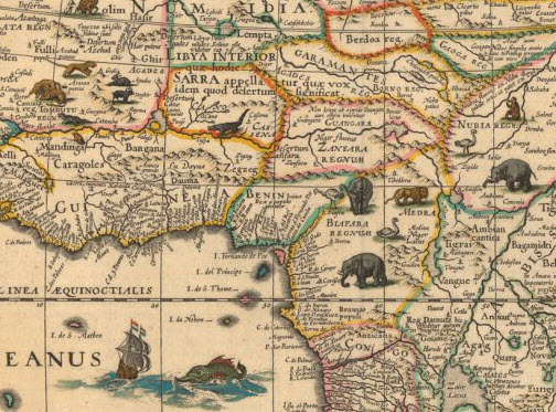 From Willem Janszoon Blaeu’s 17th Century map of Africa.
These elephants were largely marched off maps of Africa in the 19th century as expeditions by the likes of David Livingstone and Henry Morton Stanley provided more information to Europeans about the continent’s geography. But these explorations were fairly narrow in scope, and the vast bulk of Africa would remain Terra Incognita for years to come.
In fact, even at the 1885 Berlin Conference where, legend has it, Europe’s colonial powers each drew lines across a map of Africa and coloured in their territories with their imperial hue-of-choice, the colonialists weren’t really sure what those areas contained. Although cartographers had given up their predilection for doodling odd creatures across Africa’s interior, there wasn’t a whole lot more they could put there instead.
These maps of Africa, drawn up by a small group of Western cartographers, symbolically reinforced Europeans’ sense of control over their mapped territories and subjects, but they didn’t betray much in the way of real information. Though they would have been seen as objective and impartial at the time, in retrospect it is clear how subjective, ideologically-driven, and, in many ways, fantastical they were.
Fast-forwarding to today, it may seem like the situation is completely different. Any gaps in our geographical knowledge have been painstakingly filled in thanks to advanced technologies and satellite imagery. Access to maps is no longer confined to a small Western elite. And mapmaking no longer seems so ideologically charged, but far more scientific and technical.
Unlike the age in which Africa was patchily mapped through a distinctly colonialist lens, one could argue that today, we all finally know what the continent − and indeed the world − actually looks like.
But things may not have changed as much as one might assume. No map is completely objective and every cartographer has to make countless decisions over what is more important and what is less so. Some of these choices may be purely technical, some may be issues of historical convention, and some may be informed by ideological assumptions. But these decisions − as invisible as they are in the final product − have to be made and they all fundamentally change how we see the world.
In today’s maps, Africa arguably gets as rough a deal as it always has. Now as ever, the continent may not look like we think it does.
Mapping the corners of the world
One way in which we imagine Africa is through world maps. But as far back as Ptolemy, in the 2nd Century Roman Empire, cartographers have known that drawing an accurate map of the world is basically impossible. The world is spherical, a map is flat, and there is no obvious way to get around this.
One way to demonstrate this is to imagine you have the hollow peel of an orange and that you somehow have to turn that into a flat object. Two things become quickly apparent: 1) there are an infinite number of ways to do that, and 2) none is particularly satisfactory, let alone a neat rectangle.
This problem of reducing a 3-D world to a 2-D representation has always haunted cartographers, and the shapes of world maps have typically been hugely diverse, ranging from hearts to half-circles to squashed turnips.
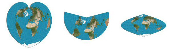
Left: Johannes Stabius’ pseudoconical projection (~1500); Centre: Johann Heinrich Lambert’s conic projection (1772) ; Right: A pseudocylindrical projection used by various cartograhers (1600s)
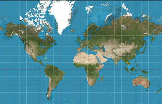
This diversity faded away, however, as one particular model gradually surpassed all the others to become the world map that is now ubiquitous on classroom walls, in books and now even on Google Maps. For many people today, that projection − invented by the Flemish cartographer Gerardus Mercator in 1569 − is the world map.
The main reason Mercator’s projection became so popular was because of its navigational usefulness; in his map, straight lines represent lines of constant compass bearing. However, in manipulating the map to ensure this feature, the sizes of countries become hugely distorted. In particular, the southern hemisphere appears much smaller than it is in reality.
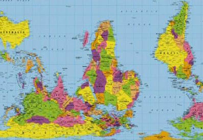
For instance, in the Mercator projection (below), North America looks at least as big, if not slightly larger, than Africa. And Greenland also looks of comparable size.
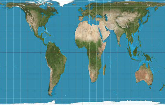
But in reality, Africa eclipses both. As is apparent in the Gall-Peters equal projection map (below), you can fit North America into Africa and still have space for India, Argentina, Tunisia and some left over. Greenland meanwhile is one-fourteenth the size of the continent.
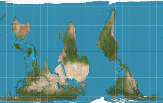
Another age-old convention that has subtly but seemingly innocuously under-privileged the southern hemisphere in world maps comes from the fact that the North is always put at the top of maps. This was not always the case. In Medieval Christian maps, East was located at the top because it was believed the world and Garden of Eden emanated from the East. Meanwhile in Islamic maps of around the same period, South was up.
The fact that our maps typically put North at the top is a mere convention. But like with Mercator’s various technical manipulations, very minor decisions can have very major effects on how we see the world.
It would of course be silly to speculate on whether world history would have taken any different turns if our basic cartographic conventions had been different over the last half a millennium, but imagine for a moment that when we pictured the world we live in, we all thought of this:
In pursuit of the perfect map
Aside from the age-old conventions still used in today’s world maps, one could argue that thanks to new technologies and the vast amounts of data they allow us to access, we have at least entered a new era of cartography since the height of colonialism. Maps are no longer mere symbols of dominion drawn up by conquerors; Africa is no longer mostly Terra Incognita; and one could make the case that maps now belong to everyone.
At the heart of this is the rise of Google Maps, which has come to dominate cartography today, both in terms of resources and popularity. Billions of searches are made through Google each day, and Google Maps is by far the most widely used smartphone app in the world. Thanks to Google’s access to masses of data from satellites, aircrafts and camera-fitted cars, users can see aerial photographs and street maps of virtually the entire planet.
Google Maps claims to be on a “never-ending quest for the perfect map,” and one might hope that with the creaking weight of information now available, the goal of a truly accurate and truly objective map may finally be within reach.
Jerry Brotton, historian of cartography and the author of A History of the World in Twelve Maps, however, warns against such notions.
“Mapmakers have always claimed objectivity,” he says, “and cartographers always imagine they’re creating maps from some omniscient Godlike position. When it comes to Google Maps, however, the reality is that they’re being produced on the west coast of America.”
According to Brotton, that fact necessarily affects how they are made. All maps, he argues, are of their time, of their place, and serve certain purposes. Medieval mapmakers wanted to chart their orientation to the Garden of Eden or Mecca; Mercator wanted to make things easier for sea-faring navigators; and colonialists wanted to plot the extents of their empires.
Today, Google has its own partialities and purposes in creating huge maps of the world, and Brotton believes that these motivations lie in Google’s corporate goals.
“For me, it seems clear that Google Maps are driven by commercial multinational profitability,” he says. “They are ultimately driven by the prospects of advertising revenue.”
Indeed, Google relies on advertising for almost the entirety of its nearly $60 billion annual income. One way to think of Google’s business model is that its massive advertising revenue allows it to offer its services free of charge. But another way to think of it is that the near monopoly the company achieves by providing its ubiquitous services for free gives it the dominance necessary to generate those ad dollars in the first place. Google’s corporate motto may be ‘Don’t Be Evil’, but it’s bottom line is still ‘Make A Profit’.
It is arguably this reality that has led Google to spend massive sums of money on developing Google Maps, but which also affects what is put in and what is left off its maps.
“It is telling that some townships in South Africa are just blank spaces on the map,” says Brotton. “In Google’s corporate model, certain communities just aren’t of any interest. Mapping is becoming privatised, not even states have the vast resources necessary to compete, and inevitably the usual problem is that Africa comes very low down on the pecking order.”
Worlds apart
The history of the Mercator projection and the North-is-up convention show how small cartographic decisions can make huge differences in how we see the world. Just recall how strikingly different the upside-down Gall-Peters map looks to the conventionally-oriented Mercator projection.
The decisions made by Google’s engineers may have similarly huge repercussions on how we interpret the world, though this argument is more difficult to clearly demonstrate. Firstly, the decisions Google Maps make may operate in far more subtle ways than, for example, deciding which way North should point.
However, secondly, it is much harder to quickly highlight Google Maps’ particularity because there are no real alternatives to which we can look. We can imagine that if all of Google’s data and programming ability was suddenly in the hands of a Namibian agriculturalist, a Sahelian nomad or a Senegalese fisherwoman, the maps they would conjure up would be completely different. They might well prioritise soil types over Starbucks, wells over Walmarts and the state of land degradation over panoramic streetviews of American towns. But we can only imagine. As was the case a century ago, it is still just a small group of Western individuals with specific ideas of the world that have the resources to map the world.
In 1976, the writer-cum-statesman Lennart Meri wrote that “If geography is prose, maps are iconography.” While the study of the earth’s features may be an ongoing descriptive process, he suggested, the map is both more and less than that. The information a map can convey is fairly limited, but the symbolic or ‘iconic’ power it can convey is almost limitless.
This was the case with ancient cave paintings, Roman tapestries, and grand imperial charts. And it is still the case with Google Maps today. All of these maps communicate much more than mere information and all of them necessarily contain within them the worldviews of their makers. Now, as ever, those makers are a very specific group of people from a very specific part of the globe, looking at the world through a very specific lens. To return to Jonathan Swift, our 21st century cyber-cartographers may not be filling in the “gaps” with “savage pictures” anymore, but that may be because from 10,000 miles and a universe away, these gaps simply don’t exist.
Amendment [02/04/2014]: In the original, the Latin phrase for ‘unknown land’ was wrongly translated as terra incognito rather than terra incognita. This has now been changed. Thanks to the tweeter who pointed it out.